
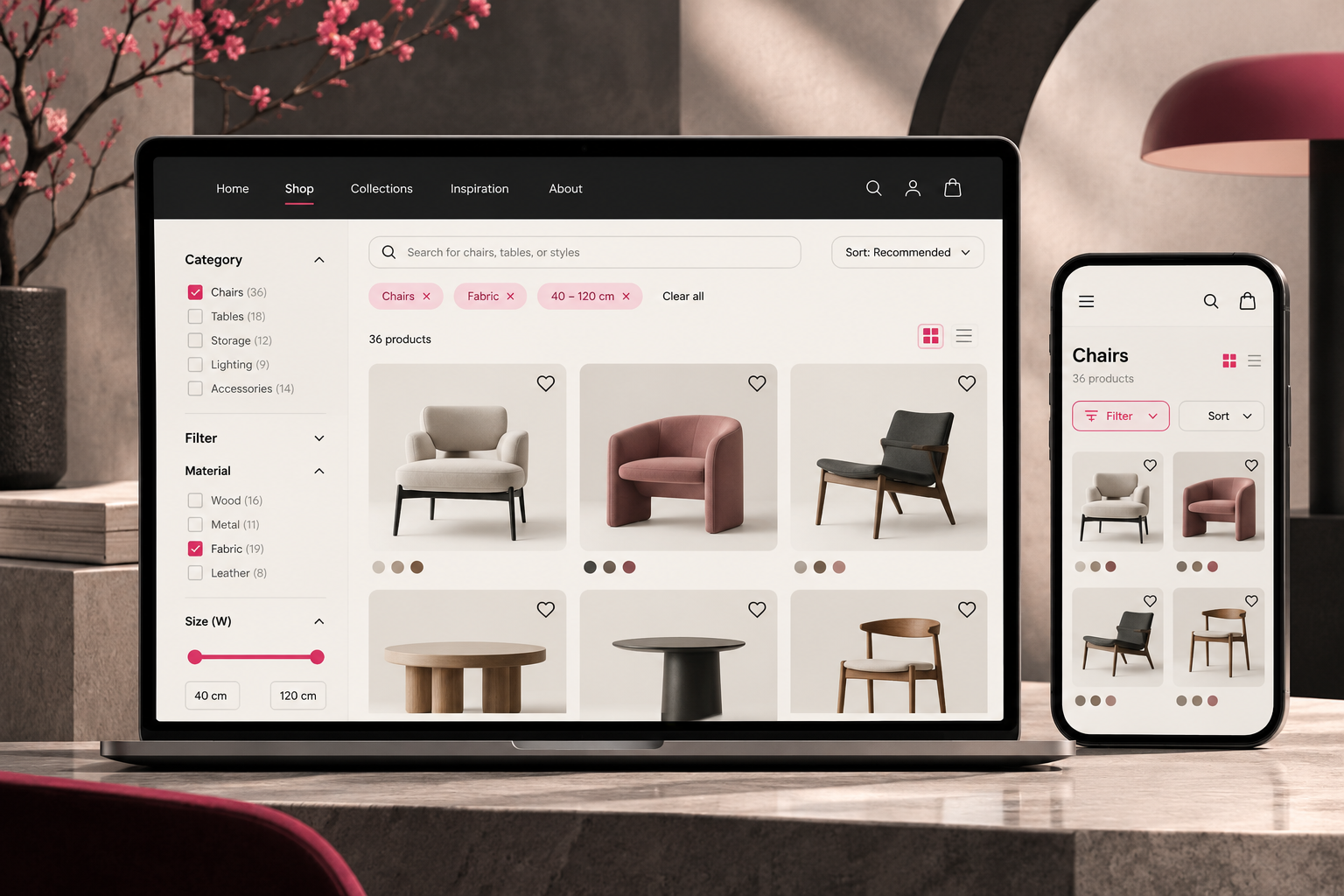
A furniture retailer may have dozens of chairs in stock, from task chairs to lounge seating and contract furniture. Yet a visitor looking for a chair for a compact room may still need to scroll through the entire catalog. The problem is not necessarily the products, their photography, or their prices. It may be the path customers must take to discover them.
Product availability is not product discoverability
Product discovery covers categories, search, filtering, sorting, and the information shown before someone opens a product page. A complete catalog is useful only when visitors can narrow it to relevant choices. In its 2025 product-list benchmark, Baymard Institute reported poor-to-mediocre experiences on 58% of desktop ecommerce sites and 78% of mobile sites in its sample. These figures describe benchmarked sites, not the Thai ecommerce market.
Four places where shoppers lose their way
1. Categories organized for the business, not the buyer
Internal collections, product codes, and sales divisions may make sense to a merchandising team. Customers, however, often think in terms of use cases: a small apartment, a restaurant, or a home office. Category labels and navigation should bridge the business’s product structure and customers’ vocabulary.
2. Search that recognizes names but not needs
A shopper may type “small black office chair” rather than a model name. A search system that relies on exact naming can overlook suitable products. Teams should review real search terms, synonyms, attributes, spelling variations, and the way results are ranked. Improving search begins with understanding what people mean, not simply adding a larger search box.
3. Filters that are present but difficult to use
More filters do not automatically create a better experience. Relevant attributes depend on the category: material, dimensions, intended use, and price may matter most for furniture. Visitors should be able to combine selections, understand which filters are active, and remove them without starting again. Mobile interfaces need particular attention because filters often sit behind a separate panel.
4. Attractive product cards with insufficient information
Beautiful photography attracts attention, but a customer comparing furniture may also need dimensions, materials, and available finishes before opening each product page. For electronics, compatibility may matter more. Product cards should reveal the attributes that help customers decide which items deserve closer inspection. Baymard’s research on listing information found that missing attributes can cause users to dismiss relevant products.
What to audit before redesigning
When a store underperforms, a visual redesign may seem like the obvious answer. But replacing the interface without diagnosing its friction can reproduce the same problems in a more polished form. Start by tracing a realistic customer task: arrive at the site, choose a category, search, narrow the results, compare options, and open a product page. Observe where users hesitate, backtrack, or repeatedly open irrelevant items.
Combine usability sessions with analytics and internal site-search logs where available. Investigate whether the underlying issue is terminology, product data, information architecture, search relevance, or interface behavior. This distinction matters because the right intervention may be a targeted improvement rather than a full rebuild.
When to involve a UX/UI team
As catalogs expand or retailers add new product categories, discovery becomes a system-design challenge. A UX/UI team can help map information architecture, define search and filtering logic, create user flows, and test prototypes before development. A productive brief should describe the customer’s problem and business constraints, rather than prescribing new screens from the outset.
Design for decisions, not only display
An ecommerce website should help visitors discover, evaluate, and compare products with confidence. Sometimes the most important design question is not “How can we make this page look better?” but “Why can customers not find what we already sell?” Answering that question gives a redesign a clearer purpose.
Further reading: Baymard Institute, Product List UX Benchmark; Product Listing Information. See also Why Aren’t Customers Enquiring? and A Better Design Brief.